Just noting that we’ve switched 100% of our focus to Previs Pro, a previsualization and storyboarding app for iPad and iOS (and probably Mac eventually.) So like many blogs before it, this one is probably mothballed. Maybe for a short time, maybe for longer. But check out previspro.com, it’s wonderful.
FabFocus at two and a half
Final update for FabFocus as it currently exists…
We built our “Portrait Mode” app before Apple announced theirs but decided to ride their wake rather then try and (god forbid) compete! (see: here) Our elevator pitch was pretty much “Portraits for the rest of us.” It’s done very well as a paid app, and continues to, but as more users get newer iPhones with built in Portrait Mode that pitch has become less compelling. What to do?
We’re remaking FabFocus with a new targeted pitch of “Professional portraits on your iPhone.” Here’s the strategy. Apple is constrained by needing their software to be usable by everyone, which keeps it clean and limits their ability (and desire) to add lots of customization. So that’s Apple, what about other competition? There is a proven market for “pro” seeming photo apps. See Halide or Camera+ (in it’s second decade of sales!) How do we compete with apps like those? The answer is specificity and luck. Specificity in that we optimize just for portrait taking, that will allow us to build a deep, more accessible and higher quality experience. And luck in that because FabFocus was a very early portrait app, and it’s been successful for years with hundreds of 4+ star rating, FabFocus is very strong for the specific keywords a pro app would want. Words like Bokeh, and Portrait etc. Most app discovery is via App Store searches these days, so if we can create a high-end enough pro portrait app, FabFocus might inherit a valuable niche on the App Store going forward. At least that’s the plan!
Towards that end we’re very happy to be partnering with a renowned app developer — which I hope to talk more about soon.
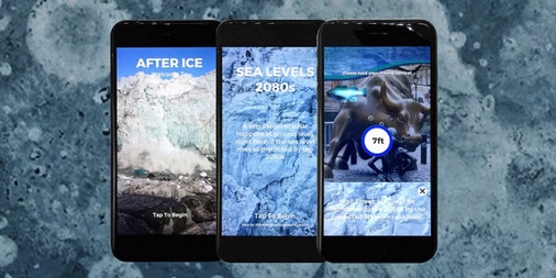
After Ice
This is a Brooklyn story. I was at a New Years day party hosted by a fiddle maker (luthier) and started talking to this guy Justin, who is an artist that works through the medium of photography. He also, and here's the hook, is an embedded artist with NASA, flying in high altitude planes over the Greenland ice sheet documenting the melting of the polar icecaps. He's focused on climate change (as am I). Not to equate us, I've been to climate marches, and can tweet with the best of them, but Justin, man, he has the Keeling Curve tattooed on his arm. See some of his work here: https://guariglia.com/
So we got to talking, he was interested in an App, and having something to coincide with a show planned for Earth Day in NYC. I was interested in doing something non-profit and, given the politics of early 2017, political. The timeline seemed insane, especially as neither of us could spare any time until mid-February. So, how to make an app in an incredibly short time, with little budget? Call Aaron Fothergill. He's the more vocal half of Strange Flavour, and they are the most passionate and fastest developers I've ever worked with. And even better, they've built fishing games, which I thought might be a huge leg up in trying to depict a flooded world.
The problem with global warming is that it's hard for humans to take seriously. It plays to our cognitive biases, our monkey brain can't handle threats that are distant in both time (decades) and space (the beach is far away for most.) We're wired to ignore distant threats. Our concept was to use augmented reality to put you viscerally in peril. We wanted the water to come up just over your eyes, we wanted you to feel claustrophobic, flooded. That was the whole goal: Trigger an emotional response in your monkey brain about the threat of global warming. And then have some links to take action, for example, donate to these guys now: 350.org.
So:
and:
and finally, the Vice President:
Fun footnote: Freeverse made the very first AR app ever for the iPhone. Fairy Trails. It may be google-able.
FabFocus at 6 Months
FabFocus continues to be a great app. It's been a Top 25 Paid Photo app all year, trending slightly up over that time period. It's currently (4/27/17) sitting at #9.
So what did we learn?
• Price insensitivity! We raised the price from $2.99 to $3.99 and sales.... didn't drop. FabFocus is a tool, and as such my guess is it's less price sensitive than say a game. It's worth noting that since prices are so (painfully) low on the App store that even a small $1 price change is a big deal to developers; that change increased our profits by 33%.
• Apple Search Ads are good. After a lot of effort, and a decent budget, they're helping. They're a small minority of sales on any given day but they're constant and give us some buffer against the random pressures of the App Store. If 1 in 1000 apps have an ad budget, then those that do will have a bit more consistent "lift" then the other 999. So the ad budget means (if we're competitive at all) that we're competing with hundreds, not tens of thousands of apps for chart placement. There's a lot more to this topic, but beyond the scope of this post.
• Master of your own destiny. It's possible to succeed without any Apple App Store support. This is a liberating realization. While the visibility is always welcome and amazing if your app is competitive, you can get into the game with the right marketing and (indy-sized) ad budget.
• Peek behind the curtain! So what does a Top 25 Paid Photography app look like? Here's our product page views and app units for 2017. We're seeing about 14% of the people who check the app out decide to buy it. I suspect that's a healthy number. Additionally, our retention is running about 10% after a week, and then has a long fade over the next month or two down to the 2-3% range. That also feels decent.
And that's the FabFocus update. You can find me on twitter at the poorly named freeverse_ian (hey, I joined in 2007!).
FabFocus Launch
About FabFocus. See this post I wrote “The Apple Leviathan and the FabFocus App” about how our second app, built in late Spring 2016, was delayed out of fear / opportunity surrounding Apple's plans. As of this writing we're one week in and things are going very well. We've been a Top 50 Photo app world wide (top ten in dozens.), were the number one Paid app, period, in Thailand, which blows my mind, and generally been about as successful as I could have hoped without any Apple iOS App Store support. I'll update this in a few months with some conclusions.
Fotomoji Hindsight
Our first release, Fotomoji, was fun but a total commercial disaster! It was our first purely ad-driven app, so there was a lot of learning about the ad networks, and the need to "optimize" the number and size of ads shown. Yuck. I think the IAP route much cleaner for a Free app if one can engineer the app to support IAP in a natural way. In terms of being ad based we made a strategic error in that we could only put an ad against the fotomoji creation, not the viewing. And the viewing was 10x the creating (at least), so yeah errors were made. It would have been better to cut a deal directly and bake a coke can or something into each image, so when it was shared everyone would have seen the ad impression. The deepest error though was even though our choice of emoji effect was timed just right for the late 2015-2016 emoji infatuation wave, and the effect of a mosaic made out of emojis sounded good, and was engineered amazingly well, at smartphone sizes and social media resolutions the output was too often "weird" rather then "awesome". And really that's all there is to it. If the effect had been awesome, all the other issues could have been addressed. Now the algorithm would be amazing for a billboard or print ad, so if any marketing company is reading this, let's talk. :-)


